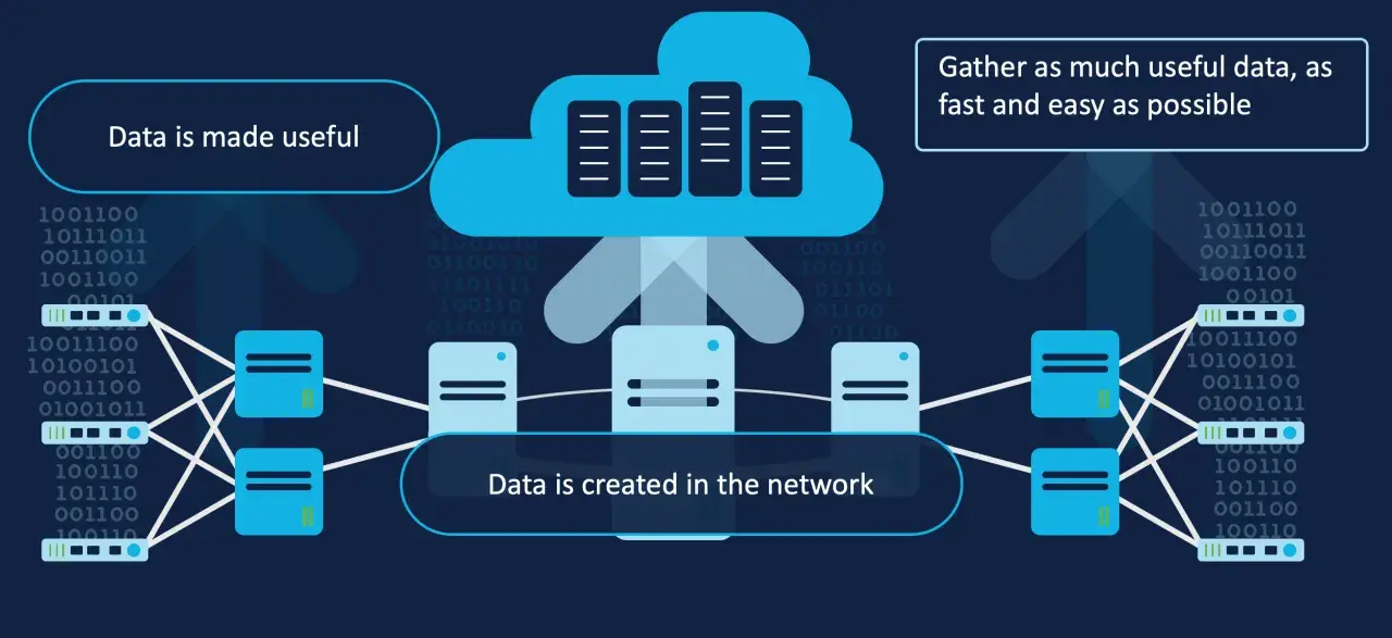
Reliable visibility starts with raw operational data: latency, loss, jitter, interface errors, queue depth, route churn, and the changes that usually explain them. In practice, network telemetry is what turns a network from a black box into something you can interrogate with evidence. This article breaks down how that data is collected, transmitted, and turned into decisions, with a practical view of monitoring, observability, and what actually helps when a network starts misbehaving.
The practical view of telemetry, monitoring, and observability
- Telemetry collects operational signals; monitoring records them; observability helps explain behaviour and impact.
- Streaming collection usually exposes short-lived issues better than slow polling.
- Metrics, logs, flow records, packet samples, and synthetic checks answer different questions, so I do not treat them as interchangeable.
- Good pipelines depend on consistent labels, sane retention, and alerts tied to user impact rather than raw thresholds.
- The fastest wins usually come from correlating network data with application errors, change windows, and service-level objectives.
Why telemetry matters more than classic monitoring
The useful mental model is not “monitor everything” but “collect, record, interpret, assess”. RFC 9940 from the IETF makes that distinction explicit: telemetry is the collection of operational data, monitoring keeps a record of it, analytics extracts insight, and observability uses those signals to assess behaviour. I find that separation genuinely useful, because a router, a cloud interconnect, and an application tier can fail in very different ways while producing the same symptom: users feel the slowdown before anyone can explain it.
That distinction matters even more in hybrid estates. A UK enterprise might have branch offices, leased lines, cloud workloads, SaaS traffic, and security controls spread across different providers. If all you see is a single “network down” alert, you are already behind. If you can see where latency rose, where loss started, and which path changed first, you can cut incident time dramatically.
| Layer | What it answers | Best use | Where it falls short |
|---|---|---|---|
| Telemetry | What is happening right now? | Raw collection from devices, links, tunnels, and services | By itself, it does not explain cause |
| Monitoring | What changed and what should I watch? | Dashboards, thresholds, baselines, and alerting | Can be noisy if it only tracks symptoms |
| Analytics | Why is this pattern emerging? | Correlation, trend analysis, anomaly detection | Needs clean data and context to be trustworthy |
| Observability | What is the network’s behaviour and impact? | Root-cause analysis and service-level assessment | Fails if the underlying signals are incomplete |
Once those layers are separate in your head, choosing the right signals becomes much easier, which is where the practical work starts.
Which signals actually belong in the pipeline
I would rather collect the right few signals well than dump every counter into storage and hope the answer appears later. The most useful sources usually fall into five buckets, and each one answers a different question.
| Signal type | Best at | Typical examples | Main trade-off |
|---|---|---|---|
| Metrics | Trends and thresholds | Interface utilisation, packet loss, RTT, queue depth, CPU, memory | Good for change detection, weak on causality |
| Logs | Event context | Config changes, tunnel resets, auth failures, link flaps | Noisy at scale, especially if retention is long |
| Flow records | Traffic patterns | Top talkers, east-west movement, application paths | Useful for direction and volume, not full packet detail |
| Packet samples | Deep troubleshooting | Retransmits, MTU issues, handshake failures, suspicious payloads | Expensive and often sensitive |
| Synthetic checks | User experience | DNS lookup, VPN login, HTTP checkout path, API probe | Only covers the paths you choose to test |
My rule of thumb is simple: keep high-resolution metrics for short troubleshooting windows, then roll them up for trend analysis. For many teams, a 24 to 72 hour window at second-level granularity is enough for incident work, while five-minute and fifteen-minute aggregates are better for longer-term planning. That balance gives you evidence without burying the team in data they will never revisit.
It also helps to think about frequency as a design choice, not a default. A 60-second poll can miss a 15-second congestion burst, while a streaming feed can catch it. That matters most for links, tunnels, and service paths that change quickly.
How data moves from device to decision
A clean pipeline usually has five stages, and each one can fail in a different way.
- Generate the signal at the source. Counters, events, and timestamps should be created as close to the device or service as possible.
- Normalise the data early. Site names, device roles, interface labels, and service identifiers need consistent naming before the data starts multiplying.
- Export with the right transport. Push-based streaming is often better for fast-changing links, while polling still has a place for legacy equipment or low-value counters.
- Store with tiers, not one giant bucket. Short-term high-resolution data, medium-term rollups, and long-term aggregates are usually more practical than keeping everything at full detail.
- Correlate with topology and incidents. A graph of the network, change records, and service maps gives raw numbers a shape that humans can use.
Push matters. If you are trying to catch short-lived failures, waiting for a poll cycle is often too slow. In practice, I use polling when compatibility or cost forces me to, but I favour subscriptions and streaming whenever the network can support them. The point is not novelty; the point is not missing the moment when the fault actually happened.
The biggest mistake here is shoving every counter into one collector without preserving the source context. If the collector cannot tell which site, service, and path produced the sample, the numbers may be accurate but still useless.
How to connect network data with application observability
This is where the value becomes obvious. Network visibility is strongest when it is tied to application behaviour, because most incidents are only partly network incidents. A slow checkout page, an intermittent API timeout, or a failed login sequence may begin with a DNS problem, a path change, or a saturated link, but the symptom lands in the application.What I want in a mature setup is shared context: timestamps, region tags, service names, change windows, and a way to align network events with app errors and traces. If a deployment went out at 14:05 and latency jumped at 14:07, that matters. If a London region is healthy but a branch site in Leeds is failing while the WAN circuit is flapping, that matters too.
- Use the same time base. If timestamps are inconsistent, correlation becomes guesswork.
- Track service impact, not just device health. An interface can look fine while the user journey is broken.
- Map network events to business services. That is how you stop treating every incident as a generic infrastructure issue.
- Keep synthetic checks close to real user paths. A checkout, VPN, or API probe is more useful than a vague “ping the box” test.
For UK organisations, this matters across retail, finance, SaaS, and public-sector environments where traffic often crosses multiple providers and cloud regions. When I can line up network data with application failures, I spend less time proving that something is broken and more time narrowing down where it is broken. That leads directly to the next problem: avoiding the habits that make the dashboard look healthier than the system really is.
Common mistakes that make the picture look cleaner than it is
Most telemetry failures are not caused by a lack of data. They are caused by bad collection habits, poor naming, or alerts that are too detached from reality.
- Collecting everything at the same cadence. Fast-changing links need more attention than static inventory data.
- Using raw thresholds as the only alerting model. A threshold can tell you that something crossed a line, but not whether users were affected.
- Letting labels drift across tools. If one system says “LDN-01” and another says “London-core”, correlation gets brittle.
- Retaining full-resolution data for too long. Expensive storage does not create insight on its own.
- Ignoring the collector path. If the export pipeline is broken, dashboards can remain green for the wrong reason.
- Capturing payloads when counters would do. Deep inspection is useful, but it is not the first answer to every problem.
I also see teams underestimate how often change, not failure, is the real trigger. A route change, firmware update, firewall rule edit, or DNS policy tweak can introduce symptoms that look random until you compare them with the change log. If your platform cannot overlay operational data with change events, you are making life harder than it needs to be.
Where the value shows up fastest in real operations
The best way to judge this discipline is by the speed at which it shortens incidents. A few common scenarios usually deliver the strongest returns.
| Scenario | Signals to watch | What you learn quickly |
|---|---|---|
| Branch or site outage | Interface counters, gateway reachability, tunnel state, latency to the edge | Whether the fault is local, provider-related, or upstream |
| Cloud interconnect issue | Packet loss, path changes, BGP or tunnel events, application retry rates | Whether the cloud edge, WAN, or application tier changed first |
| Security anomaly | Unusual east-west flows, reset storms, DNS spikes, authentication failures | Whether the pattern looks like scanning, misconfiguration, or lateral movement |
| Change validation | Before-and-after baselines, synthetic checks, error rates, service latency | Whether the change improved anything or introduced regression |
This is why I treat telemetry as both an operations tool and a security tool. The same data that reveals congestion can also reveal strange traffic patterns, control-plane churn, or a sudden burst of failed handshakes. In practice, the overlap between observability and security is larger than many teams expect.
What I would prioritise first in 2026
If I were building a new programme from scratch, I would not start by trying to instrument everything. I would start by making the first layer reliable and useful.
- Pick the few signals that map directly to user pain: link health, latency, loss, and service availability.
- Standardise labels for site, region, role, and service before the data enters long-term storage.
- Use push-based collection where the network changes quickly, and reserve polling for the parts that truly need it.
- Correlate network data with app errors, synthetic tests, and change records from day one.
- Keep alerting tied to impact and service-level objectives, not just to raw counter movement.
A mature network telemetry programme does not just report that something is wrong; it narrows the problem to a place, a time window, and a likely cause. That is the difference between a noisy dashboard and a system that genuinely helps you run the network better.